Here is a great video to watch and follow along with to enhance the eyes.
Enhancing the Eyes
Friday, March 21, 2008
Friday, March 7, 2008
Accenting a Photograph
This tutorial is to help you learn how professional photo editors accent specific parts of a picture in order to lead their viewers attention into certain places. With this technique you can darken what is not important and brighten what is important to your photo. This technique uses a 50% gray overlay layer. But remember that this example is a somewhat extreme demonstration of this method, it is more commonly used to create very subtle accents.
- First of all, create a new Layer (Layer>New>Layer).
- Then when the New Layer Dialog box comes up Choose Overlay from the Mode drop menu, and Then check the box that says, "Fill with Overlay-neutral color (50% gray)"
- Then choose a big preferably soft paintbrush and set the opacity down to somewhere between 7% and 14%.
- To Darken Areas: with the color black carefully stroke your paintbrush on the Overlay layer that you created.
- To Brighten Areas: with the color white carefully stroke your paintbrush on the Overlay layer that you created.
- For different photos, the process and amount of adjustment won't be exactly the same. But with this technique you can attract a viewers eye to any subject that you want. You can brighten shadows on people's faces, or darken the flash bulb effect on a photo. This technique becomes almost a necessity to touching-up any photo once you get used to using it.
Hue and Saturation without losing the Exposure
- Adjust the Levels, (Image>Adjustments>Levels).
- Make sure the levels range is set to fit the range of color, for this photo I had to move the right end of the levels range in to fit the colors.
- Change the Image Mode to Lab Color, (Image>Mode>Lab Color).
- Create a New Curves Adjustment Layer, (Layer>New Adjustment Layer>Curves).
- Change to Channel a
- Move the corner adjusters in approximately one square, you may wish to adjust them more or less depending on the photo.
- Change to Channel b
- Move the corner adjusters in approximately half a square, you may wish to adjust them more or less depending on the photo.
Using the Clone Stamp Tool to remove unwanted objects
This tool can be time consuming and difficult so take your time and keep practicing :)
- Select the Clone Stamp Tool from the tool bar, pick a good sized brush and set the opacity to about 95%.
- Hold alt and click somewhere to take a good sample. (Wherever you take a sample, that's what your going to be drawing in place of the removed object).
- Release alt and carefully click and drag the mouse over the item you wish to remove. (You will notice that the spot where you took the sample will follow your movements).
- Continue to repeat steps 2 and 3 until the unwanted object is completely gone. You might have to change techniques a little based on available places to take a good sample. With practice this tool is very valuable.
Tuesday, February 26, 2008
Snapshot Photo
Color Snapshot / B&W Background
1. Make a rectangle selection of the area that you want to be in color using the Rectangular Marquee tool
2. Choose Select -> Transform Selection and click and drag outside the bounding box to angle the selection. Hit Enter. From the Select menu choose Inverse
3. From the Image menu choose Adjustments -> Desaturate. Then press Shift - Control - I to get back to your original selection
4. From the Edit menu choose Stroke. Enter 12 for the width and change the position to Inside
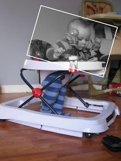
B&W Snapshot/ Color Background
1. Make a rectangle selection of the area that you want to be in color using the Rectangular Marquee tool
2. Choose Select -> Transform Selection and click and drag outside the bounding box to angle the selection.
3. From the Image menu choose Adjustments -> Desaturate.
4. From the Edit menu choose Stroke. Enter 12 for the width and change the position to Inside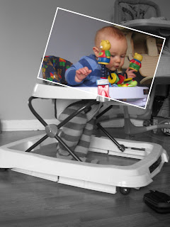
1. Make a rectangle selection of the area that you want to be in color using the Rectangular Marquee tool
2. Choose Select -> Transform Selection and click and drag outside the bounding box to angle the selection. Hit Enter. From the Select menu choose Inverse
3. From the Image menu choose Adjustments -> Desaturate. Then press Shift - Control - I to get back to your original selection
4. From the Edit menu choose Stroke. Enter 12 for the width and change the position to Inside
B&W Snapshot/ Color Background
1. Make a rectangle selection of the area that you want to be in color using the Rectangular Marquee tool
2. Choose Select -> Transform Selection and click and drag outside the bounding box to angle the selection.
3. From the Image menu choose Adjustments -> Desaturate.
4. From the Edit menu choose Stroke. Enter 12 for the width and change the position to Inside


Wednesday, February 20, 2008
Contact Sheets
For those into photography, you'll appreciate this and for those who aren't - you could do a really great decorative piece with all of your child's photos; just print and frame!
By de-selecting the Flatten Layers option, you now have the ability to edit text, add black boxes around the images to set them off, etc...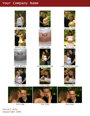
- File -> Automate -> Contact Sheet II
- De-Select Flatten All Layers
- In the Contact Sheet II dialog box set the Width to 7 and the Height to 9
- Choose the number ofimages you want on the page by changing the Columns and Rows field (the fewer amt of pics the larger they will be)
- This will take a moment to work so sit back and relax :)
- Once this is done, it's time to add your name and contact info
- Image -> Canvas Size -> 8.5 x 11
- Create a New Layer but make sure it is UNDER the layer with your photographs
- Fill with white (Edit -> Fill -> White)
- Center your images on the page
- At the top, Type in your Name
- At the bottom Type in your contact info and make sure you put your copy wright symbol down there
- Print and mail it out to your clients!
By de-selecting the Flatten Layers option, you now have the ability to edit text, add black boxes around the images to set them off, etc...

Monday, February 18, 2008
Color Correcting and Tone
1.Flatten your first layer, then deplicate so you can easily get back to your original layer at any time. Use Control+J for duplicating.
2.Make yourself a new color balance layer with the adjustment layer icon.
3.With this new layer you can now adjust the midtones, shadows, and highlights separately. Every photo needs different editing. Beware of burning certain parts with highlights and shadows. Keep values even otherwise you'll have an odd looking effects. Always enable the preview option and click OK when it looks slightly better than before.
4. Now flatten the image. Layer>Flatten Image.
5. Again, duplicate the layer with the hot key you used before. You will now have a background layer and the new one you just created.
6. Change the new layer model from normal to hardlight in the layer menu. Adjust the layer opacity to about 65%, but the opacity for your specific photo could be from 40% to 90%. Use your judgment to determine what is best for your photo.
7. Create a new layer, except this time a Levels Adjustment layer. Modify the RGB Channel. First number is used to adjust the overall dark tones and shadows contrast. Use about 25. The second number is to adjust the midtones levels in your photo. Use 1.43. Its used to lighten your picture without dodging parts. Use 250.
8. Create another new layer, except a Hue and Saturation adjustment layer. Now you can edit the tone of each color in the Edit box. Don't put the values too high.Use the preview option. This will give you an idea of how it will look.
9. Flatten all your layers once more. Now your photo should look more enhanced.
10. Go to Image>Adjustments>Variations. Now you can tone the photograph how ever you look. For my photo I used green, blue, and cyan because of the specific landscape it is. Since mine is a lake, it was an appropriate color choice. If you have a forest, use greens and yellows. If you're using a sunset, you can use reds, yellows, and blues. Try to play with different color options to see what fits best. If you need to dark or lighten your photo when you adjust the variations, do so.
Before and After


Subscribe to:
Posts (Atom)